Recently, I had the pleasure of speaking with Megan Van Dorn, Associate Director, Data Analytics & Insights at Rutgers University Foundation.

In addition to her work in analytics, Megan has worked with the Foundation’s Prospect Development team as both a prospect researcher and a prospect management analyst. She currently works closely with departments throughout the Foundation to provide visual data solutions that guide decision-making processes, including prospect prioritization, tracking stewardship tasks, and measuring engagement factors. Megan holds a BA in music and communication arts, as well as an MBA in nonprofit management, from Caldwell University. She has also earned an MLIS with a concentration in digital libraries from Rutgers University’s School of Communication & Information. Megan currently lives in central New Jersey with her husband, son, and two “constantly-Instagrammed” cats.
Megan Van Dorn.
Photo by John O’Boyle
In her role, Megan creates automated visual data solutions, including Tableau dashboards and Excel templates, for departments throughout the Foundation and she recently created data visualizations using Foundation constituents’ diversity and ethnicity data. To put Megan’s work in context, the Rutgers Diversity Strategic Plan includes five priorities that encapsulate areas in which the university believes they need to make progress:
1) Recruit, retain, and develop a diverse community,
2) Promote inclusive scholarship and teaching,
3) Define sustainable and substantive community engagement,
4) Build the capacity of leaders to create inclusive climates, and
5) Develop an institutional infrastructure to drive change.
These priorities reflect shared objectives that enable Rutgers to define benchmarks for achievement and structural mechanisms for accountability to be a beloved community.
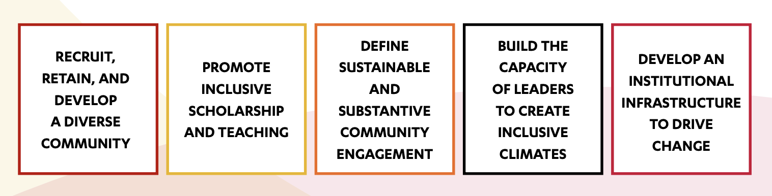
Screenshot taken from: Universitywide Diversity Strategic Planning Toolkit
The Rutgers University Foundation plays an integral role in supporting these priorities and the work Megan has done with data visualizations is particularly compelling. Below is our conversation, edited for clarity.
CS: Can you tell me a bit about yourself and your journey in the field and how you ended up doing this specific work?
MVD: I never expected that I would end up in data analytics, but my career in advancement started because I had a lot of nostalgia for my college experience and was looking for a way to give back. I was the first in my generation of my family to finish college, and I got through college thanks to a great deal of financial support, including scholarships. I started out working in alumni affairs at my undergraduate institution, Caldwell University, a small, private college in northern New Jersey. As I was working in the alumni office, I realized that being on the front lines really wasn’t where my heart was. I was much happier in the background, working with the data, working with mailing lists, doing the back office and administrative work. In 2010, I joined the Rutgers University Foundation and started out with the Prospect Development group.
My supervisors recognized that I had an aptitude for prospect research and prospect management, so I was moved into those roles first. And, because I was willing to further myself by learning more about how to use Excel in an advanced way, going to library school, where I learned more about data and data visualizations, opened the door for me to get into data analytics. I’ve been working with Tableau since about 2016 or so, and my work with this tool landed me a spot on the Foundation’s new Data Analytics & Insights team in 2019. So, it took a while for me to land where I am now, and although it was sort of an unexpected path, I’m really glad I landed where I did.
CS: Can you tell me about the Tableau dashboards regarding diversity and ethnicity data? Why did this project start?
MVD: I was approached by one of our internal work groups whose focus is on diversity, equity, and inclusion, particularly as it pertains to our alumni base. Based on the data that we carry in our Advance database, we have a data set that feeds to our Tableau Server and is updated nightly. I was able to create a series of dashboards that update in real-time every 24 hours to show the makeup by race or ethnicity of our alumni population, as well as what their giving has looked like over the past 25 years. These dashboards can answer questions like:
- How much have people been giving?
- What kinds of wealth capacity ratings do we have on file for them? And what percentages of each group constitute our donor base?
- What percentages do we have accurate information for in terms of contact information, employment information? And what percentages have had any significant contact with our frontline fundraisers?
These dashboards have been rolled out to the DEI committee, as well as a consultant who is working closely with that committee.
CS: So, when they asked for this project, what were the initial goals or what did you interpret they wanted to do with this data? And then how does that compare to what you found and how else it might be used?
MVD: We initially did this as a way to get a 10,000-foot view of the racial and ethnic makeup of our alumni base. As I got started, though, we discovered some gaps in our race and ethnicity data that will require even further analysis, and that will entail some conversations with our colleagues on the University side to make sure we are capturing all the necessary data points going forward. Some of these gaps had to do with the nature of historical data where code values have changed over time. So, this project not only provided that sort of 10,000-foot view that we were looking for, but also provided us with a 10,000-foot view of where the gaps are in our data.
Our work group is currently working with these dashboards, but plans are in progress to roll this out to just our frontline fundraisers in general so they can see the makeup of the populations of the schools that they support/fundraise for.
CS: And were you working with anyone else on this project or was it mainly you creating the visualizations?
I created the visualizations, but a good chunk of this had to do with what the IT team was able to provide for me. As I mentioned, we have data sets that feed into Tableau Server in the form of data lakes so that I don’t have to continuously upload static data sets like Excel files. There are programmers at the Foundation who are awesome about making sure that I have the data I need when I need it and are able to get it to me quickly. So, while I am doing the actual design work and the creation of the dashboards themselves, there are definitely people behind the scenes who are helping me to make that happen.
CS: And have you finished creating the dashboards or are you still working on them?
MVD: As with all of the other dashboards that I’ve created, I always consider them works in progress. There’s always something that might have to be tweaked. Maybe I have to change some terminology that’s being used on a dashboard, maybe we have to redefine a certain metric, or maybe we need to redefine something that is going to be relevant to whoever’s using the dashboard. And as I mentioned earlier, for this project in particular, there will be some additional analysis of the data points themselves. So it’s “published,” but I will definitely return to it to refine it as time goes on. Our Foundation data dictionary has also helped with user understanding of data.
CS: Do you know in what ways who has been using them and how?
MVD: The taskforce is really just getting started with these dashboards, but I also have numerous other sets of dashboards that are in wide use that sometimes incorporate similar data points. For example, there is a set of post-event dashboards I created that are used by our Alumni Engagement team, the Advancement Events team, as well as frontline fundraisers who want to know how their school is doing with their events. This set of dashboards also includes some breakdowns by race and ethnicity. This can be used to determine if we are offering events with content that is of interest to all alumni groups.
CS: How have these tools been useful for your department?
MVD: When you want to be able to tell the story visually, as opposed to pulling out tons and tons of spreadsheets and trying to decipher the data from there, I think Tableau does an excellent job. The fact that you can hook up a “live” dataset to it in order to tell the story of the data has been super helpful as well. We’ve gone from static to dynamic and I think that’s a fantastic change for us.
[As an additional resource, check out Tableau’s Racial Equity Data Hub here.]
CS: As someone who’s probably most familiar with the race and ethnicity data dashboard specifically, what do you think was the most interesting thing you saw or the most useful way you could look at what kind of data?
One of the things that came up when I was speaking with a representative from our internal task force and their consultant was how the number of donors in a specific group may have increased in a certain year, but the dollar amount didn’t necessarily increase. This could be caused by a lot of people giving smaller annual gifts, like for our Giving Day or a very specific initiative that people may have been approached for. Pulling this particular data tells an interesting story—you have a group of people who seem inclined to give, so maybe the next question from there should be, is there a way to increase the amount that they are giving? What do we have to do to strategize to increase the dollar amount, not just the donor count?
You can do a lot of slicing and dicing in Tableau using filters and parameters, so if you only want to look at one part of your population—maybe only Newark, maybe only Camden, maybe only New Brunswick – you may see that there is a story that’s being told in one part of the university that looks entirely different when you go to another part of the university. Tableau gives you the ability to create drop-downs and checkboxes so you can really drill down to get to the story you’re actually looking for.
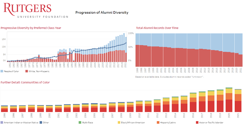
As an example of Megan’s work, this dashboard illustrates the shifts in class populations by race, with a specific focus on the past 25 class years. We see an upward shift towards a more diverse population as time goes on, particularly as class sizes grew from 2010 and forward. Additional dashboards were created to track giving history by specific groups; overall giving to funds related to diversity, equity, and inclusion; and percentages of the population who have had different types of engagement (e.g., event attendance, meetings with frontline fundraisers, or completed major gifts) with the University.
CS: Can you speak a bit about the role of having good data or quality, up-to-date data in this sort of project?
MVD: My motto is: “If it’s not in the database, it didn’t happen.” I can’t do anything with data that doesn’t exist. So, it is important not only for the data to be accurate, but it has to actually be there and it has to be in the right place.I feel that as a Foundation, our Records and IT departments have been amazing in terms of accuracy in data entry and loads. The thing is, though, they can only enter what they get. I think that if you are in a frontline fundraising position in particular, it is critical to share the data you have. Even if it does not affect your metrics in any obvious way, shape, or form, you should still make sure that if your donor gives you information, that information gets into the database so that it can make it into reporting and help your team – and your fundraising staff as a whole—to make better data-driven decisions.
CS: If other schools are interested in doing a similar project, similar kind of work, like taking that long view or that 10,000-foot view of their race and ethnicity data and/or making visualizations with it, what are some basic recommendations do you have for them?
MVD: I would recommend, before you get started, take a look at what you actually have in the dataset, because you may want to try and identify the gaps first. Otherwise you may end up with an inaccurate analysis outright. If there’s missing data that can be provided by the registrar or admissions, you’re going to want to make sure you account for that before you get started, just to make sure your numbers come out as correctly as possible, and also to make sure you don’t get any real unexpected surprises.
Besides Tableau, there are a number of packages available in R that do allow for data visualization. I immediately think of ggplot2 as something that can be used to create visualizations, and can tell some really good stories. And the thing about R is that it is open source, and it is free, so that’s definitely something to consider if you’re on a budget. If your institution offers Google accounts, another useful (and free) tool to consider is Google Data Studio.
CS: Any final thoughts you’d like to share?
We’re in a time right now where diversity, equity, and inclusion in the nonprofit realm, particularly in higher education fundraising, is very, very much at the forefront. A lot of people are paying attention to it. So even if you’re not getting questions now about the diversity of your donor base or your alumni base, those questions may come sooner than you think and it is good to be prepared.
As for my own non-data-focused work in DEI, I’m actually on another task force within the Foundation, where we work on improving diversity, equity, and inclusion in the workplace. From that perspective, I think some of the things that can be done include finding ways to proactively educate your colleagues about issues in diversity and equity, opening up conversations about issues in that arena, and basically understanding that not everybody is going to have the same point of view you do, which does not necessarily mean that the points of views of other people are not as valid as your point of view. It’s an ongoing learning process.
Are you and your team doing exciting work in advancement? We’d love to feature that work on our blog! Contact Caitlin to learn more!